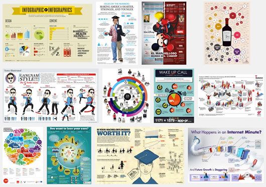

Is anybody else getting a little tired of the infographic? Sure they’re a fun and easy way to communicate (and consume) and lot of information in a short amount of time. And we’re always in support of ways to sex up boring data. But it seems like everyone and their moms are creating one these days, and they’re not always that exciting. It’s gotten so bad that there’s even entire Pintrest boards and Tumblr pages dedicated to infographic that are, well, so bad. In fact, Slate even published an infographic about why infographics suck!
Here’s another one that sums up the problem pretty well:(Explore more infographics like this one on the web’s largest information design community – Visually.)
Given this unfettered proliferation of lousy infographics, we’re always excited to find new, innovative and informative ones we like – and so we present to you “Cheetah: Nature’s Speed Machine.” Not only is the Cheetah one of the most badass animals out there, but this infographic is actually a gif that makes the whole thing dynamic – like the Cheetah itself. Plus there’s a lot of great information clustered with the great design. Who thought you could make Variable Stride Rates and Heart Proportionality fun?

Infographic designed by Jacob O’Neal (sorry may not move on mobile!)
Psst! If you’re really into these data diagrams, we thought this article was an interesting read, with some great examples of the art done right. If you’re in the opposite camp, then you’ll like this: 16 useless infographics.
What do you think of the craze? Do you have a favourite? We’d love to see them!