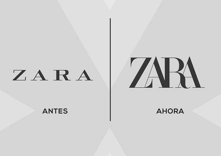
As we speak, hundreds and thousands of people are looking down at their phones in dismay, shock, awe, excitement, and possibly creating memes over ZARA’s new logo change. The world’s largest apparel retailer, ZARA was founded in 1975, and by 2019 has amassed huge success to become a global fashion powerhouse.
Today with more than 170,000 employees, 7,400 stores worldwide and over 49 online markets, ZARA‘s latest logo change comes with a lot of stir in the fashion industry. And while it is common for retailers to change their logos, ZARA‘s new branding and approach is well, not quite what we expected…
The curvy new logo was launched with their Spring/Summer 2019 campaign. ZARA‘s ability to keep up with the rapidly changing fashion styles and trends called for an over all can hange in the brand’s logo and website detailing as well. The website now features a different vibe and colour combination with the women’s section in yellow font and the men’s in an electric blue, as opposed to their classic black and white.
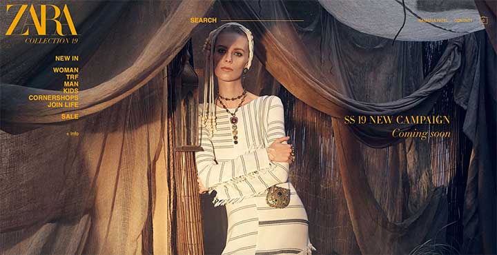
ZARA Women’s Collection (Source: zara.com)
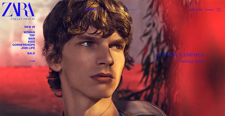
ZARA Men’s Collection (Source: zara.com)
Every fashionista’s favourite diet, Diet Prada also weighed in on the matter earlier today, making a very compelling point about ZARA‘s similarity to BAZAAR‘s logo.
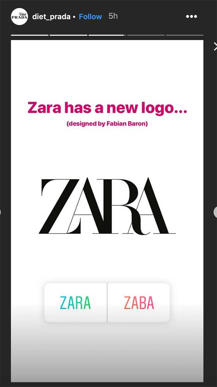
Diet Prada on ZARA’s new logo (Source: Instagram Story)
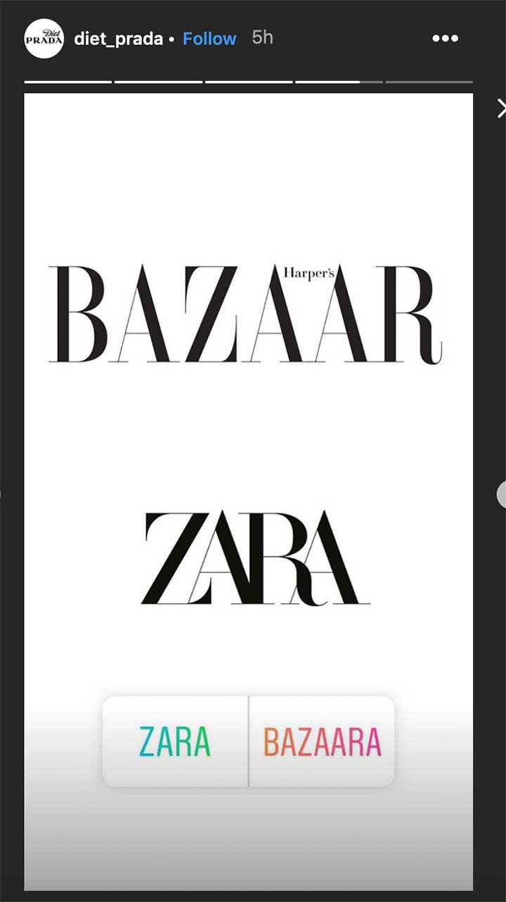
Diet Prada on ZARA’s new logo (Source: Instagram Story)
Oh and let’s not forget about the influx of memes to be seen on our feed…
While this change isn’t met with warm welcomes yet, we feel like the new logo is something that we will all adjust to even though we’re in two minds right now.
Would you want to bring back the old logo? Let us know by commenting below!