We have begun welcoming 2021 with open arms as 2020 is in its last quarter. This year may not have the best due to several reasons—the COVID-19 outbreak, economic changes, unemployment and civil issues in certain countries. But we’re here to lightening the mood via colours for the season. The Pantone Colour Institute has forecasted the 10 top colours and five core essentials for New York Fashion Week Spring-Summer 2021.
Spring signifies the start of bright hues in nature. Similarly, the palette for spring/summer reflects the same: to lighten the spirits. Giving the world a much-needed refreshment, these hues will inspire inventiveness and originality. Reinvention and flexibility is a key goal from this colour palette to recover and adjust to the new lifestyle we have now come to experience. Additionally, according to the executive director of the Pantone Colour Institute, Leatrice Eiseman, these colours can be worn all year round with their soothing aesthetic. It is meant to allow us to have fun through fashion, and play around with ample choices in comparison to the restrictions we have had to face in other areas of life.
So what are the colours we expect to see? New York designers have debuted their collection in a palette consisting of marigold orange, cerulean blue, rust, illuminating yellow and French blue to name of a few. Illuminating yellow implies optimism and joyfulness, whereas marigold is comforting and warming. Likewise, each colour evokes a feeling of comfort and positive energy. Scroll ahead to know more.
Ahead, we list 6 of our favourite shades from the colour palette that we cannot wait to wear:
1) Illuminating Yellow
Bright like sunshine, this hue will uplift your spirits on a dull day or any day of 2020 given the agenda this year. Moreover, the brightness that radiates from the hue might also help from a psychological viewpoint. We are instantly drawn to the joyful and friendly nature of this cheery hue.
2) Green Ash
Reminding us of the outdoors and beautiful nature around, this colour implies restorativeness and regeneration. We see city residents crave for greenery and tend to make way for indoor plants in their apartments. As a result, green ash is in tune with everyone’s preference. Much like the activity of gardening, this mentholated green is a soothing hue with a cooling effect.
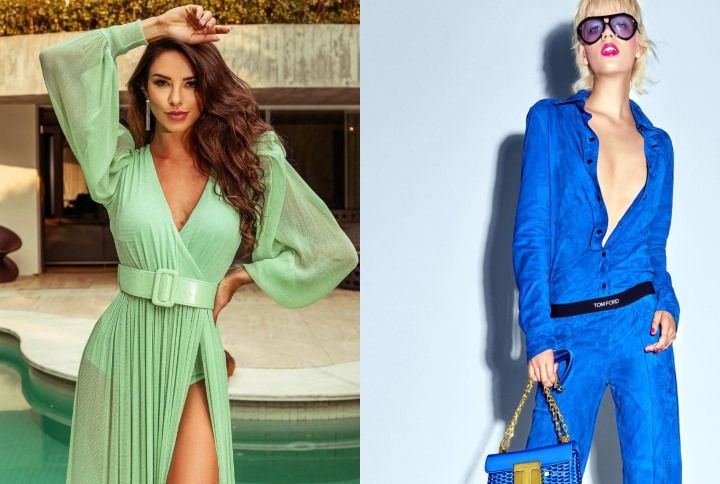
3) French Blue
A romantic day in Paris is the holiday we all want. But for the time being, the closest we can get to a visionary spring day is through the French blue Pantone. We often see this stirring blue hue as a favourite of contemporary style icons like Kate Middleton for photo-ops. Blue is a popular favourite of many people, and so devotees are more inclined to sport updated versions of the shade. The French blue is an eye-catching colour you can expect to see more of next spring/summer.
4) Raspberry Sorbet
Reminiscent of a raspberry popsicle in the scorching heat; we couldn’t be more excited to wear this tantalising hue. Every colour has a science behind it and is defined as cool or warm shade. Raspberry Sorbet is the dichotomy of both as it possesses warm and cooling properties. As a result, it is a versatile colour that you can go all out with. It is indeed an energetic hue that’s apt to sport post the lockdown.
5) Cerulean
Clear blue skies on a beautiful day can invariably have a very calming effect on our mind and souls. To appreciate this serenity, we are looking forward to wearing the Cerulean blue Pantone which is a trend for spring/summer 2021. For lovers of blue, this is another addition to the colour palette that you can style. Like a crystal clear day, this hue will look refined and elegant when worn.
6) Buttercream
This shade is one of the five core colours from the season of spring/summer 2021. A subtler variation in comparison to the vibrant shades we saw above, Buttercream is a delicious off-white hue. All of us brought out our inner chefs during the lockdown either by cooking or baking some delicacy. And so the name Buttercream is suggestive of that time. Although white is a common staple during the spring and summer season, Buttercream is a more tinted, easy and effortless version. Another hue we can add to our list of neutrals!
Which spring/summer 2021 colour are you looking forward to wearing? Let us know in the comments below.
Follow @missmalinifashion on Instagram for more updates.